


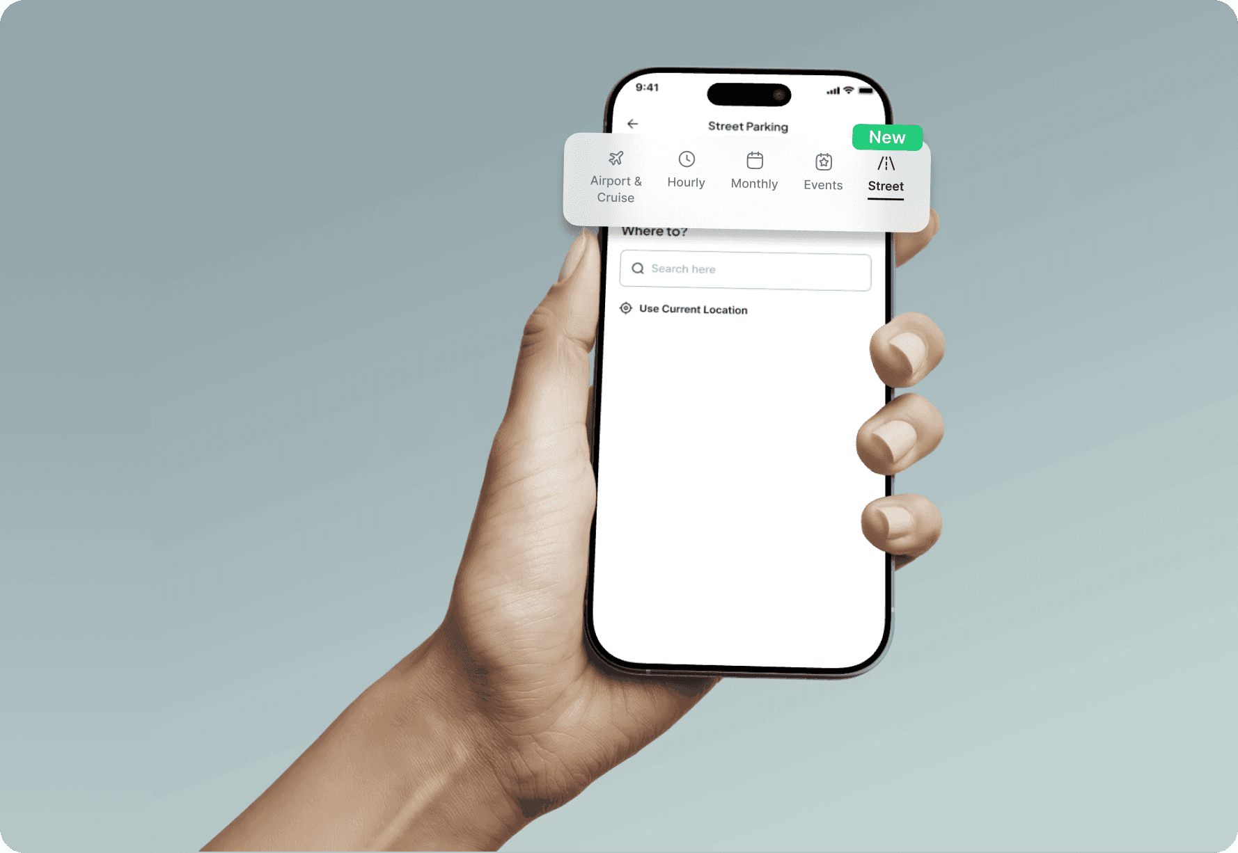


Shipped
GIS
B2C
Under Dev.
6 Weeks
Here’s a quick summary
Problem
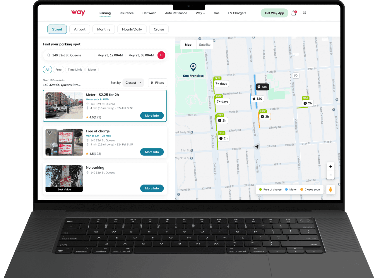
Solution
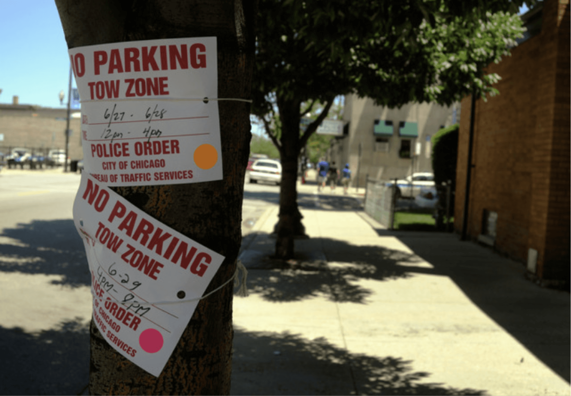
In the U.S., on-street parking rules are highly localised and change block-by-block, making them hard to interpret from physical signage alone. This complexity creates uncertainty for drivers who need to quickly understand where they can park safely without risking fines or towing.
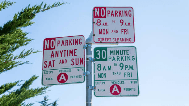

Cities issue millions of parking tickets every year, largely due to misinterpreted rules and missed time limits. For users, that means money lost. For Way, it meant a broken parking journey.
In New York City
issued in 2016
In Chicago
issued in the first six months of 2022
In Baltimore & San Francisco
is what generated as parking-fine revenue in 2019
From a quick survey, conducted by the PM, with ~20 Way users to understand real on-street parking challenges, I derived the
following insights.
Survey Insights:
Users lack a single, trusted system for street parking.
On-street parking rules are difficult to interpret in the moment.
Fear of violations drives parking anxiety.
Quick decisions demand instant rule clarity.
Before jumping into design, I took a step back to understand the problem more deeply. This approach helped me ground decisions in real user needs rather than assumptions, and it started by asking questions like…
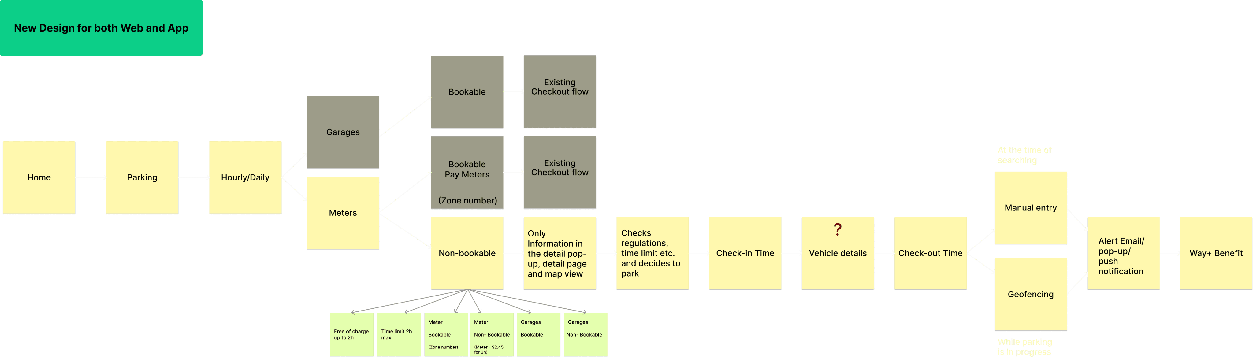
Early on, I realized this experience had to work for two distinct groups, not one.


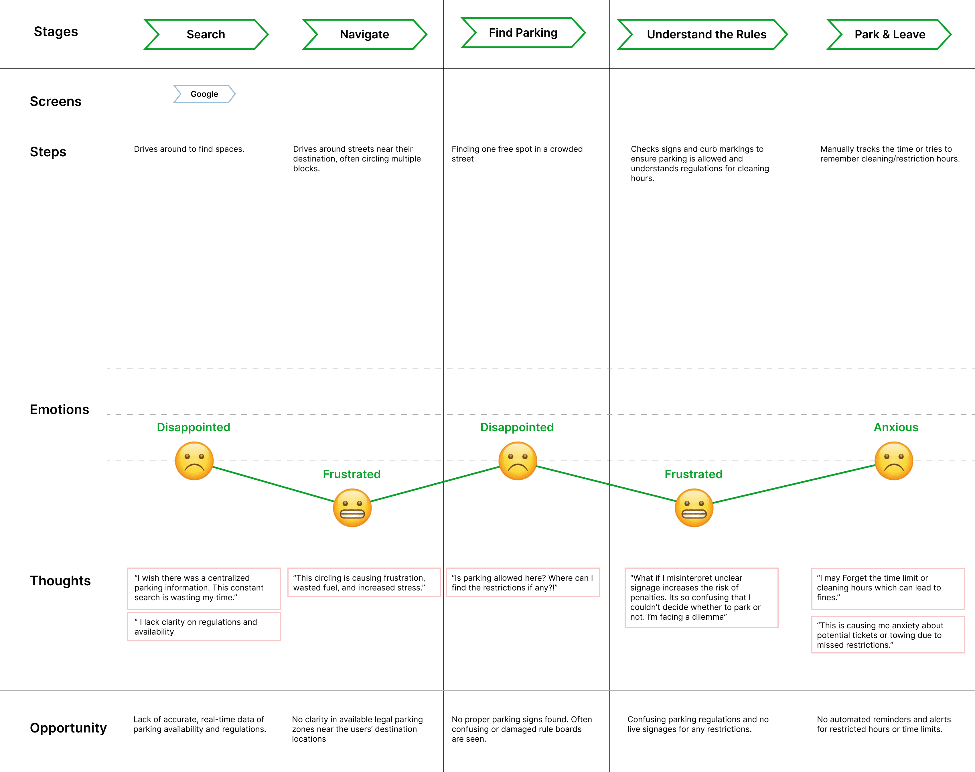
I mapped the end-to-end journey of a driver finding on-street parking to identify exact breakdown moments.
Here’s what I found on a high level:

!?


I dove into competitive benchmarking to study how others addressed similar challenges, identifying what worked, what fell short, and where we could push the experience further.


SpotAngels showed us what’s possible
The gaps
The intention was not to copy what existed, but to connect the dots into a unified experience.
Despite covering similar use cases, existing solutions consistently broke down in these areas:
Each gap identified was translated into a clear design principle, which served as a rule for what the system must do.
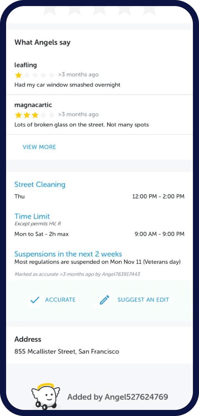
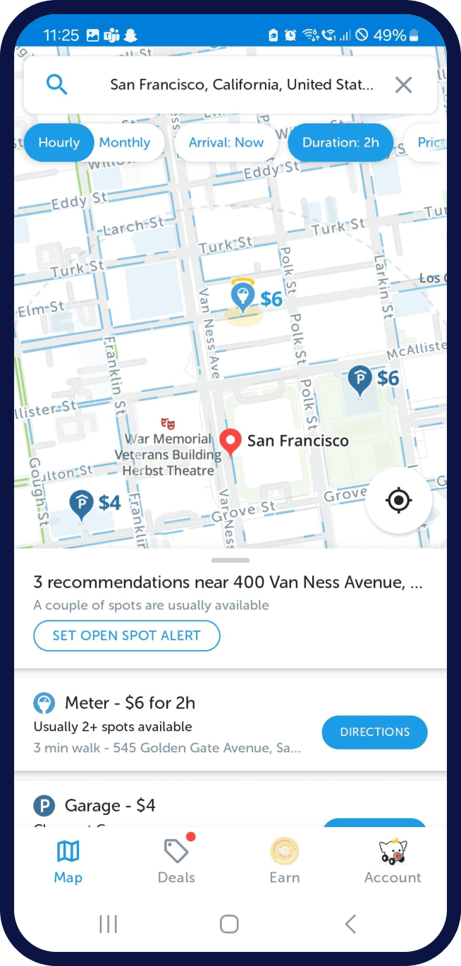
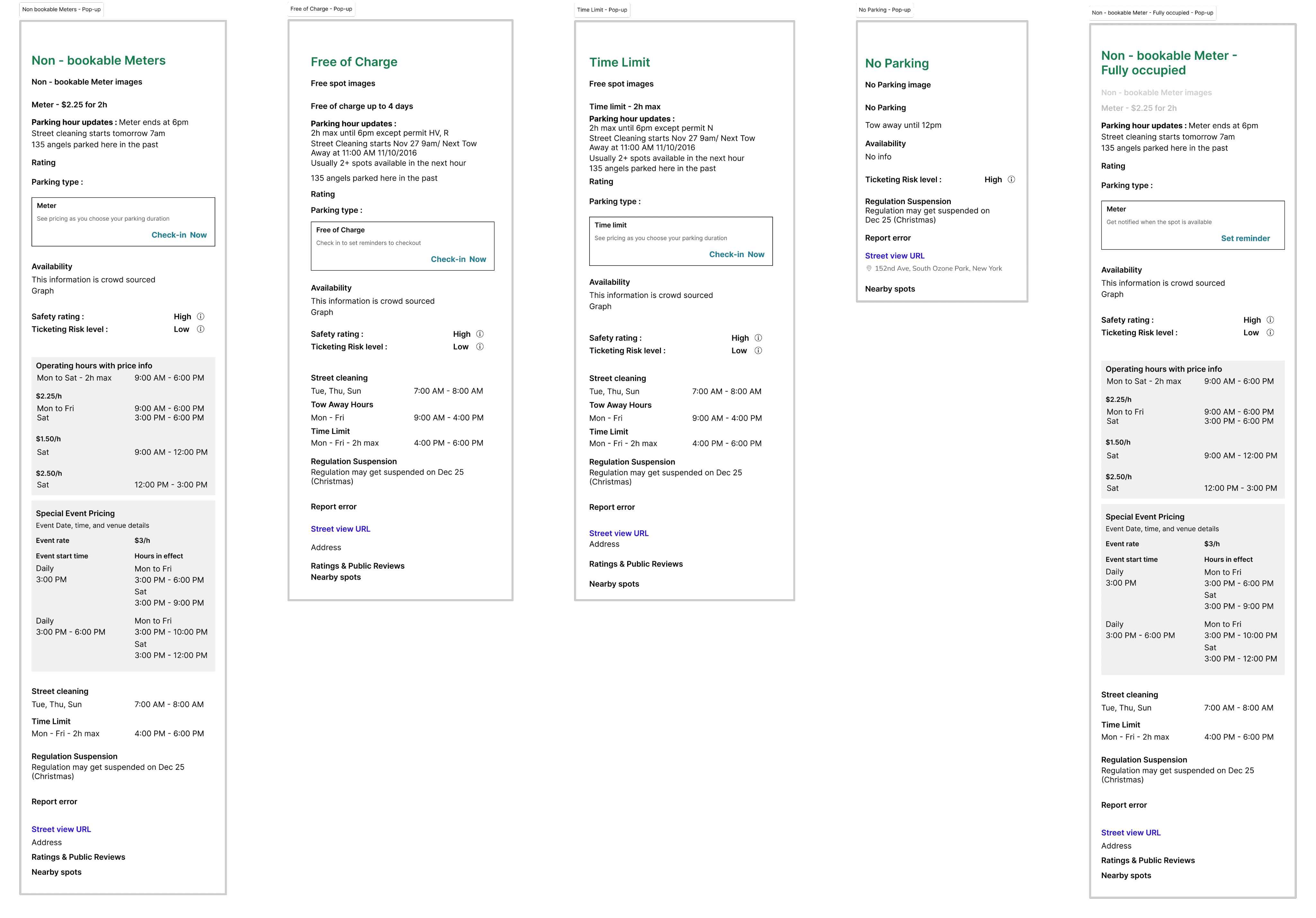
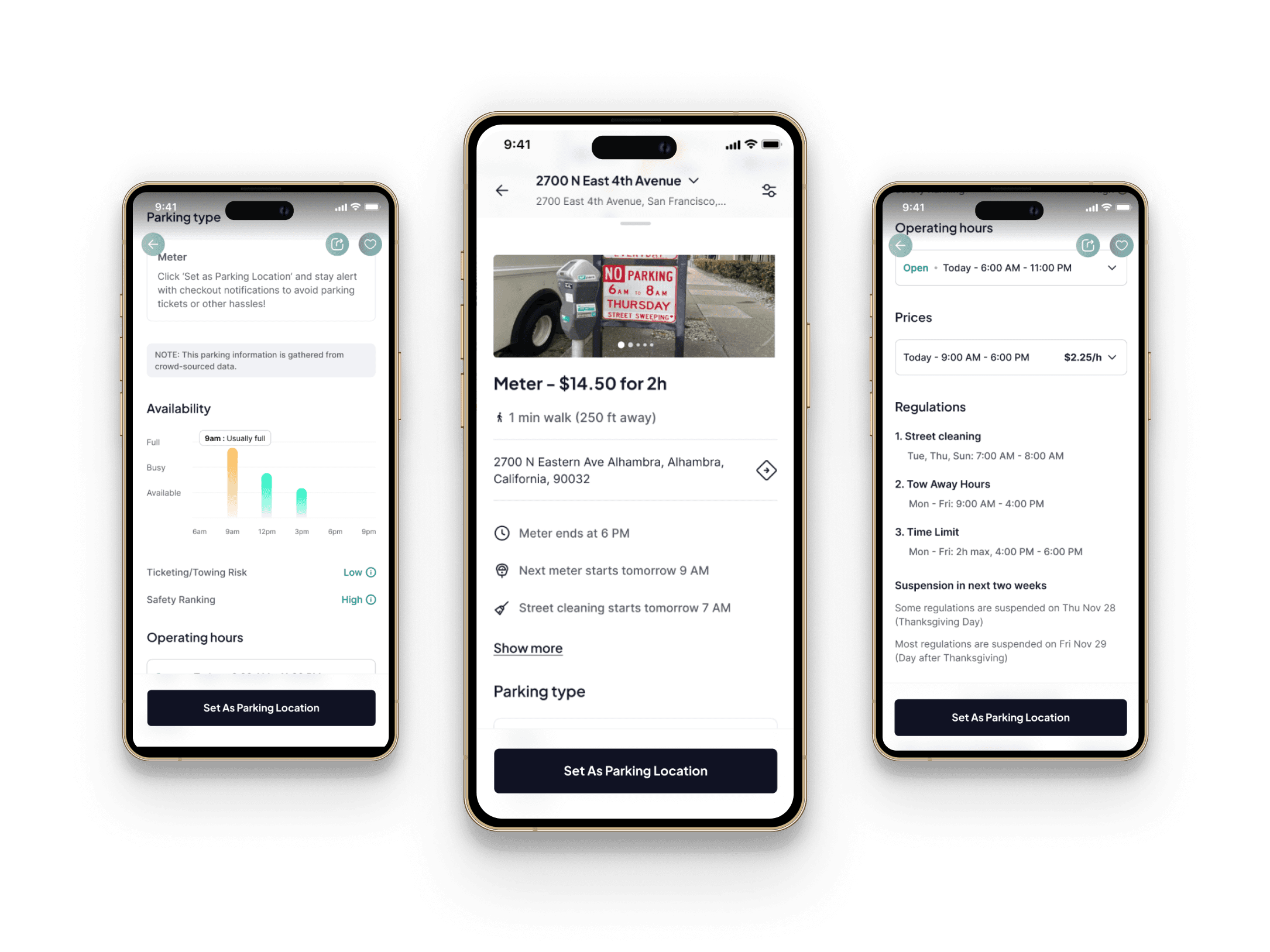
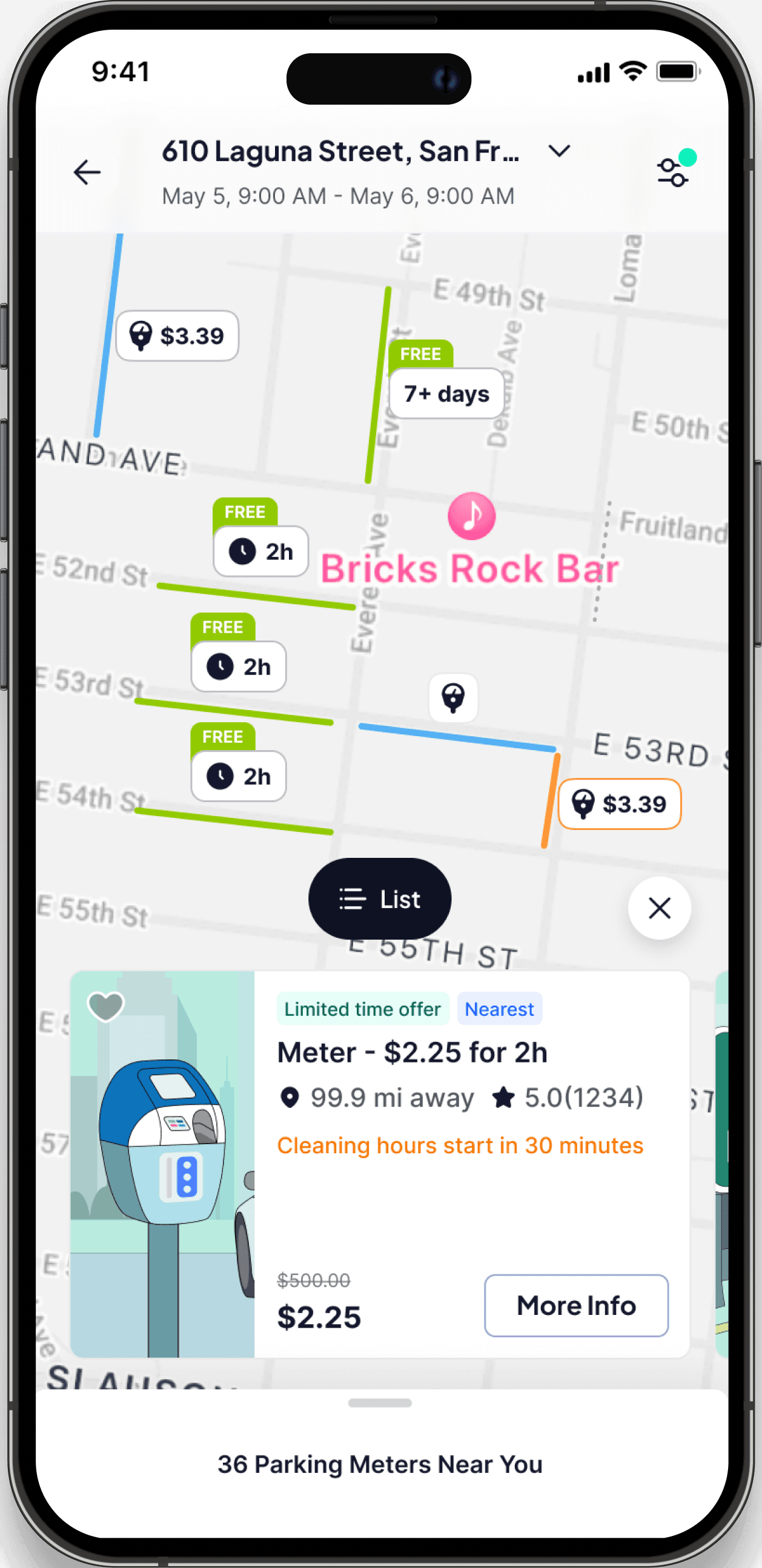
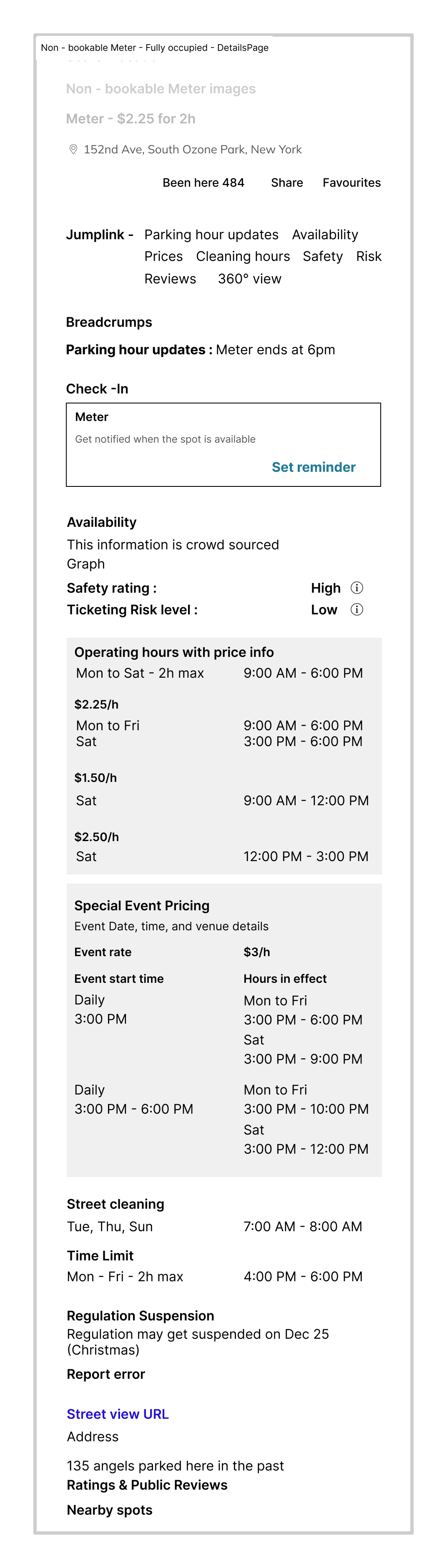
Before touching the map, I focused on the details page, where rules, risks, and edge cases converge. I broke down every on-street scenario into a clear, scannable hierarchy covering availability, restrictions, safety, pricing, and alerts.
To make sure this structure would scale beyond a single screen, I also mapped the end-to-end user flow, from discovery to parking, reminders, and edge cases. This helped me validate how each rule state travels across cards, pins, notifications, and system behaviours.

As I was structuring the parking rules and states, I ran short validation sessions with my teammates to pressure-test the logic before moving into visual design.
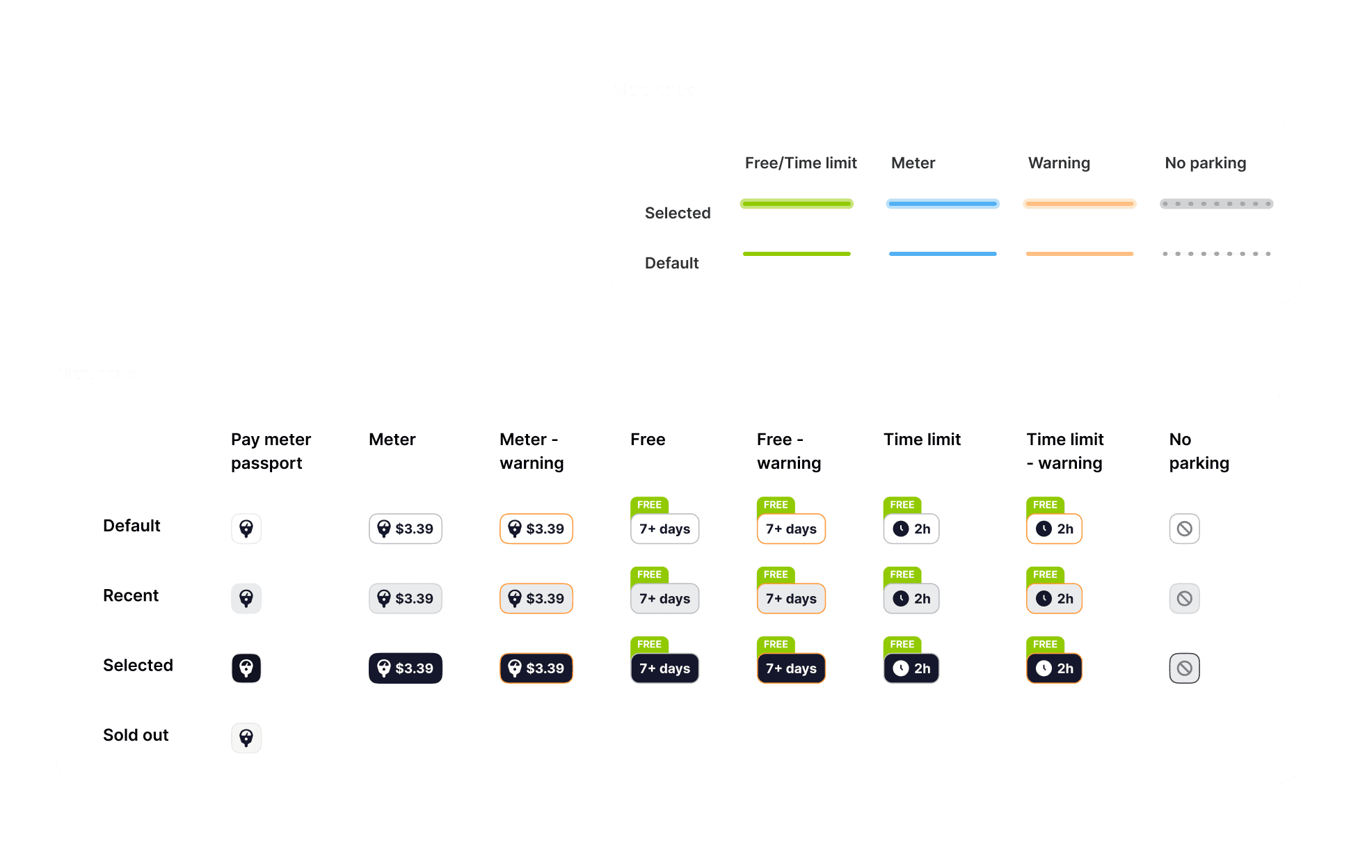
Together, we checked whether the rule hierarchy made sense at a glance, whether time-based conditions were easy to reason about, and whether different parking types resolved into clear, consistent states.
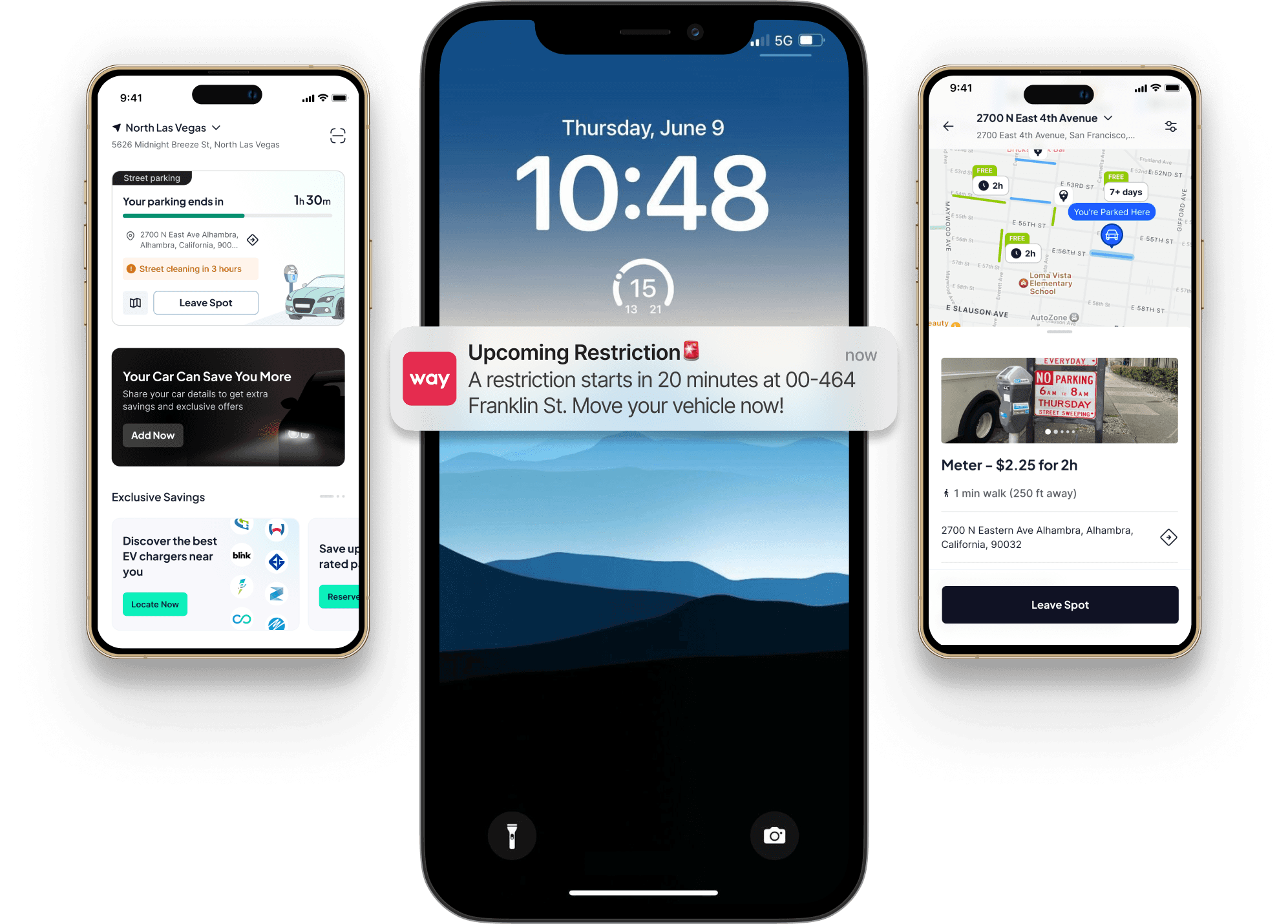
Every pin, color, and state reflects a real-world parking condition.
Interactions that reduce back-and-forth, syncing pins with cards, enabling hover-level clarity on desktop, and maintaining parity with mobile behavior.
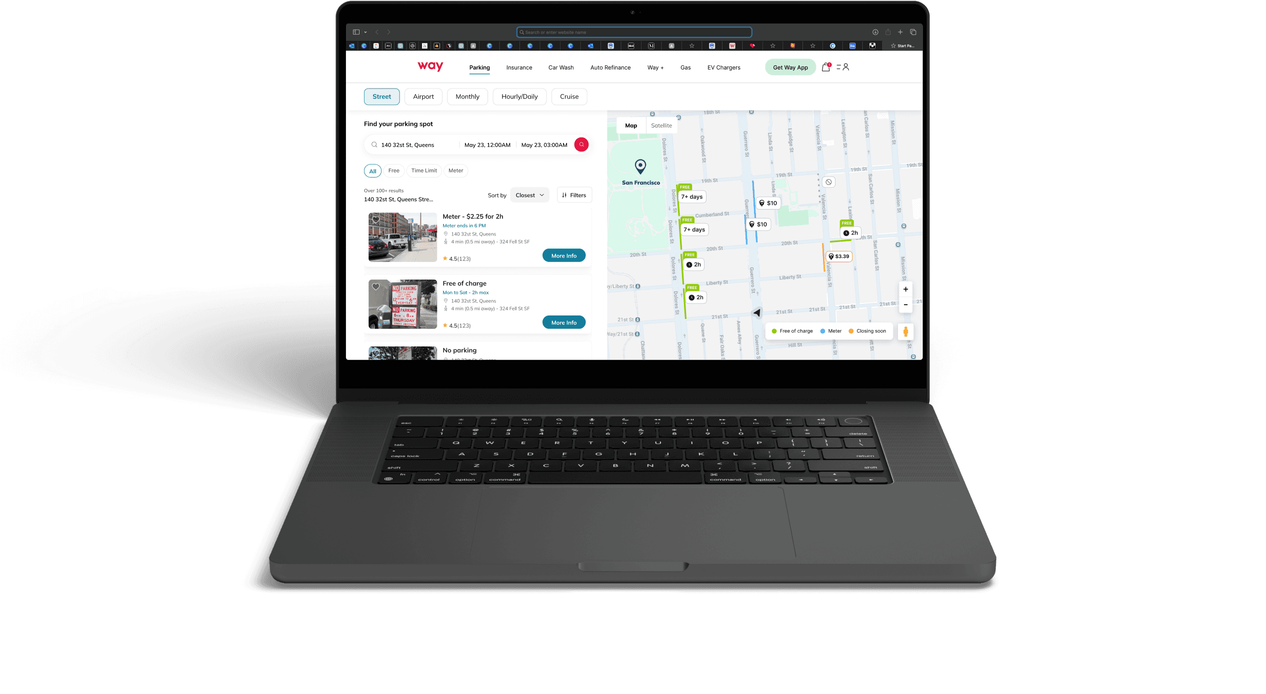
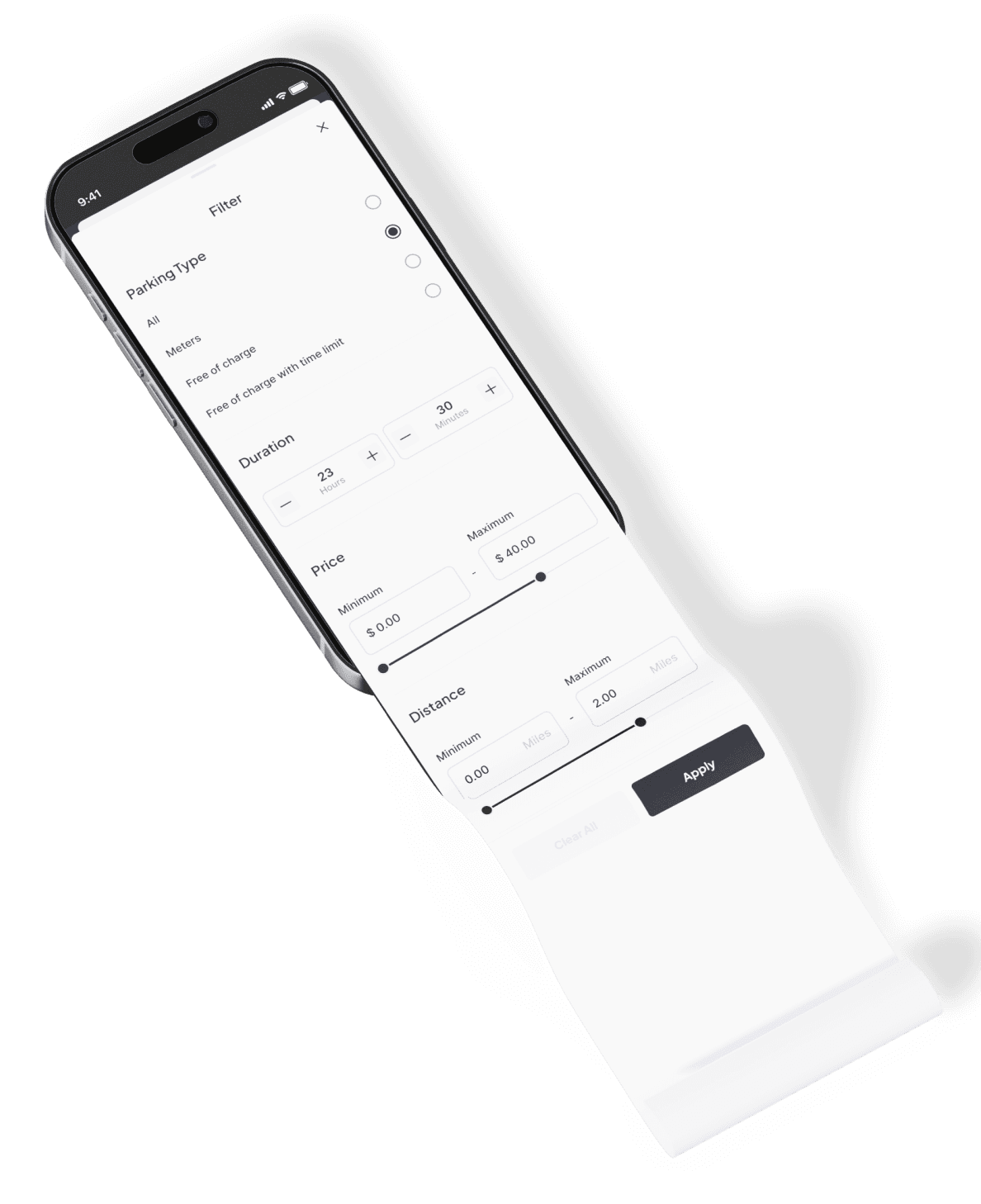
Filtering is structured around key decision factors rather than a broad set of attributes.
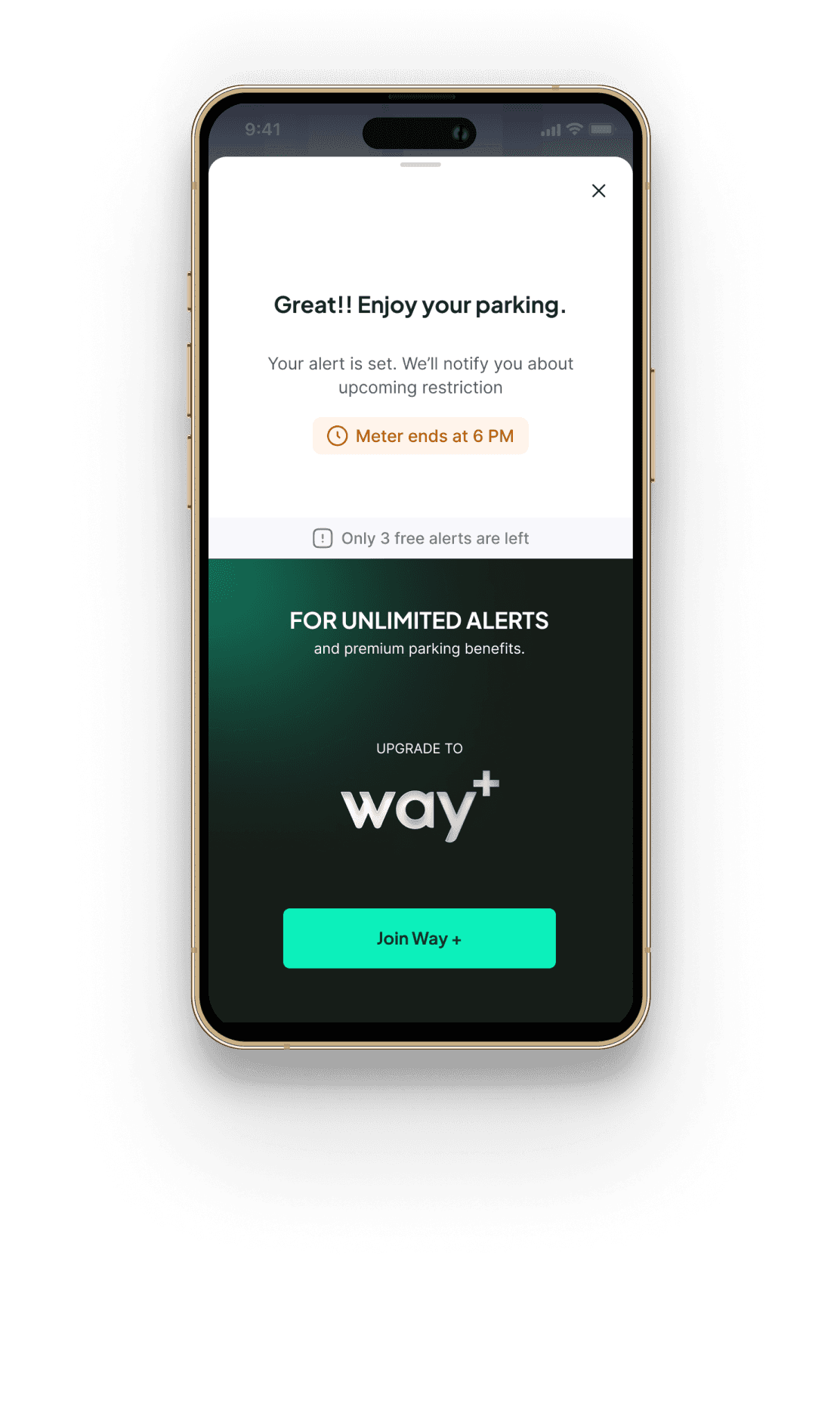
Unlimited alerts are explored as a future Way+ benefit to support longer and more frequent parking needs.

Just the essential details, adapted to time and risk.
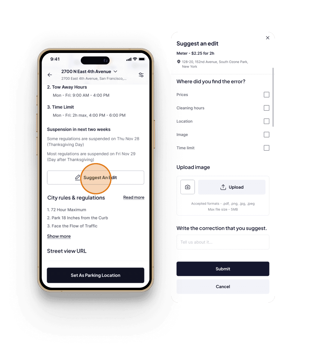
Instead of open edits, users can “Suggest an edit” with the help of the guided options.
Expected business impact
Pre-launch outcomes based on product forecasts.
This project was designed with clear user, system, and business outcomes in mind. While development was paused due to technical dependencies, the work established a complete, scalable foundation ready for launch.
User retention
+2% projected improvement in user retention and engagement
Subscription retention
~5% projected uplift in subscription retention
Subscription revenue
~$50k estimated subscription revenue impact
OEM partnership
Future OEM partnership enablement
Lessons from this project
Iteration needs boundaries
Focusing on high-impact touch-points and clear iteration limits speeds up progress.
Intentional feedback loops
Early, well-timed reviews reduce rework and accelerate decision-making.
End-to-end ownership
Managing the full system strengthens the ability to scope, prioritize, and make confident design decisions.
Think in systems, not screens
Designing rules, maps, and alerts as one system enables clarity, consistency, and scale.
Working on on-street parking taught me how much clarity emerges when complex rules are treated as systems rather than interfaces. It helped me develop stronger instincts around prioritization, structured thinking, and intentional iteration, skills I now carry into every new design challenge.